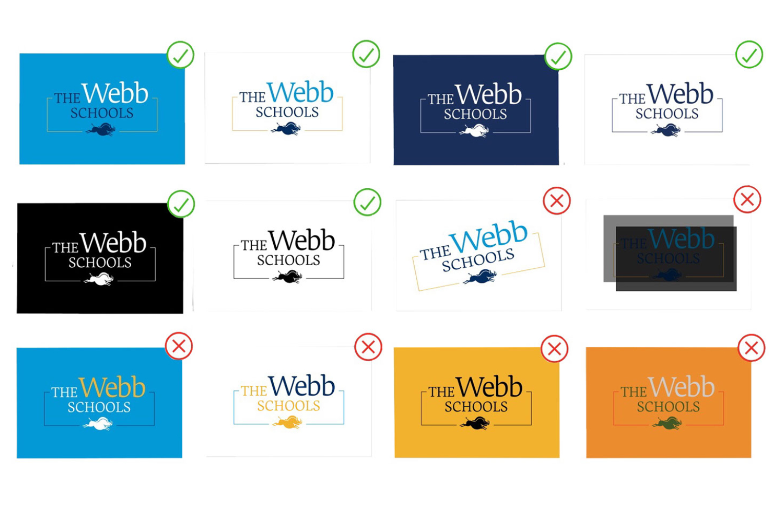
An inside look at Webb’s official brand guidelines. From an internal document, this image shows guidelines on how users can modify the logo for distribution. Graphic Courtesy: Scott Nichols.
An inside look at Webb’s official brand guidelines. From an internal document, this image shows guidelines on how users can modify the logo for distribution. Graphic Courtesy: Scott Nichols.
Webb rebrands itself: the process, the outcomes, the impact
As Webb students, we supposedly embody Webb: its academic rigor, its authenticity, its mission, its honor, its trust, and its community. But Webb recently launched its new website, releasing its new rebranding to the public. The Webb brand has now adopted a new look, a new tone, new content, new colors, new messaging, and new plans for the future. Now, the question is, does this new Webb still represent the community it speaks for?
PART 1 – The Process
Webb’s rebranding was in the works for more than two years before it was finally launched. A new brand became necessary with Webb’s centennial looming ahead.
“The institution of Webb is turning one hundred years old and the way you celebrate these milestones is you celebrate for many years and bring in as many people as possible,” said Scott Nichols, Director of Digital Communications. “We wanted to take a look at our graphics, how we portray ourselves to the public, also internally how we see ourselves and the changes that have occurred in our time.”
Webb began by employing a local graphic design company from Pasadena called Kilter to tackle this project. Together, they not only redesigned Webb.org, but also workshopped Webb’s messaging content to be more effective and draw new people into our community.
Kilter’s process when working with new companies and rebranding follows a few broad steps. First is the “Intake.” This was a period of observation for Kilter to take in as much information about Webb as possible and come to recognize the essence of our school. Members of the Kilter team sat in on our classes, spoke with students, and discussed needs with members from every department on campus.
The next step was called “Incubate.” This is where Kilter began to define Webb, construct messaging, and design first drafts of visuals.
The last step, according to Kilter, is “Ignite.” Together with Webb, the team began to refine and polish content, like choosing colors and fonts, editing written content, finalizing logo designs, all before finally launching Webb’s new brand.
One of the main goals for the rebranding was an overall revamping of the admissions information available on the website and in printed materials.
“We wanted an exciting, dynamic, fun website that … focuses on the student experience and is really geared towards perspective families … so they use the website as a launching pad to explore more about Webb,” said Dr. Jamilla Everett, Director of Admission and Financial Aid.
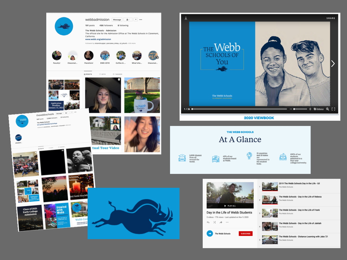
If you go on Webb.org now, you can see that at the bottom of each page, there are “apply” and “inquire” links to guide visitors to the admissions pages on the website.
Other departments on campus also had smaller, specific needs, but often found there was a common theme of creating a brand that made prospective families curious about Webb.
“
I would say that our goals are tied closely to admission in the sense that we want the best students in the world to learn about and come to our school. We want to accurately tell the story of all the amazing things happening here. For us it was about having a brand and a message that was true to who we are.
— Dr. Theresa Smith, Associate Head of Schools
Part of the new website design was to create a sort of interactive experience, highlighting student life. There are videos of student interviews on the front of the homepage for visitors to get to know what Webb is about and what Webb students are like. And even though there is a lot of scrolling like on Canvas, the scrolling on Webb.org is designed to guide viewers through the website smoothly. It is designed to effectively be a walk-through of all that is Webb.
Besides the experience, the website is designed to be more mobile-friendly. Because the old websites have been designed primary for desktop use, some changes need to be made, including making the site adjustable to different screens.
“From analytical data, we see how users are using the website, and the rise of mobile site traffic,” Mr. Nichols said. “We had to create responsive website design for different screen widths.”
All in all, this process used the help of every department on campus and took a long time to complete. After soft previews of the brand, this massive team effort was launched in late October of 2020, with expectations that parts of the brand might change and evolve.
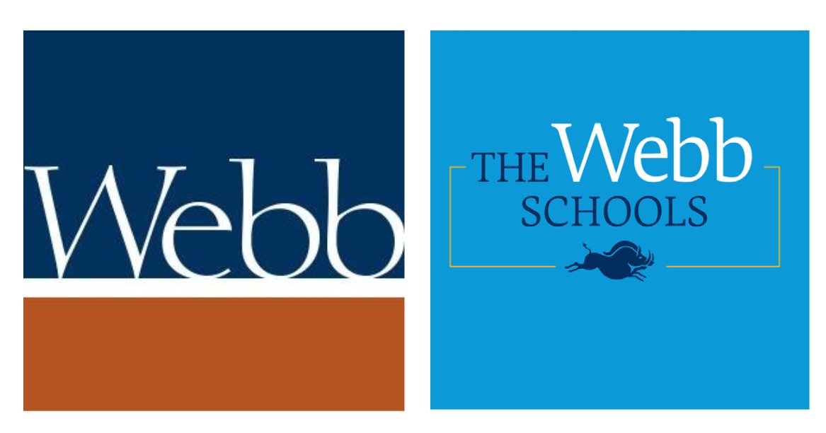
The new Webb Schools logo (right) is a sharp contrast to the old logo (left). Graphic courtesy: Laura Haushalter.
Part 2 – The Outcomes
New colors, new messaging, new logos, and a new tone are some of the many changes that occurred as a result of Webb’s new brand. With our 100-year identity and our current times, these changes in the brand help reflect the Webb we know today.
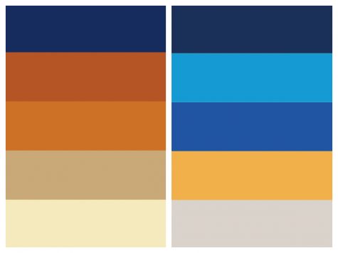
Anyone who visits Webb.org or sees the new Webb brand will quickly notice the very distinct and bright colors. The new color palate focuses on Webb’s history and geographical location, which helps embody our unbounded southern California personality.
The new primary palette includes two colors: Webb Blue and Unbounded Blue. Unbounded Blue is the background of the new logo. The words and peccary of the logo are in Webb blue. The secondary palette includes three new colors that draw from inspiration of our old colors and traditions: Vivian Blue, California Gold, and Alf Gray. The secondary palette is woven throughout other parts of the brand.
On the left are the old Webb colors, on the right is the new palette colors that are a sharp and bright contrast to the old. Graphic courtesy: Laura Haushalter (’21).
“I think the colors embody our mission,” Dr. Everett said. “Even though we moved away from the adobe the new colors are very bold and are very creative. [The colors] really do stand out, they are good for our west coast boarding school identity. I think this [new] look is very classic still and very clean … the brand does this interesting mix of being playful, fun and bold, but still traditional.”
In addition to the colors, the logo and imaging got revamped. Any successful brand must have a logo that is adaptable to different forms. You must be able to put it on social media, on the website itself, email signatures, and on printed marital. The new logo can easily be identified by the peccary pig, a node to the Raymond M. Alf Museum of Paleontology and way of research-led and unbounded inquiry learning at Webb.
In 1936, Raymond Alf and his student Bill Webb (‘39) found a mammal skull on a dig in the Mojave Desert. After the unknown mammal skull was identified as a new 15-million-year-old peccary pig, Raymond Alf was inspired to “elucidate the history of life on Earth through the study of fossils, which he called ‘the documents of life.” Since that find, hundreds of Webb students have embarked on “peccary trips” and have gotten to experience their own form of discovery.
The peccary is a symbol of the Webb education. Graphic Courtesy: Scott Nichols.
“To me the peccary has always been a kind of metaphor for the kind of learning that we do here at Webb,” Dr. Smith said.
One of the main areas of focus was to make the imaging more inclusive of two of the major changes to the institution of Webb in the last 100 years: namely, the founding of Vivian Webb School and the Raymond M. Alf Museum of Paleontology. The peccary includes the museum in the logo but with less words.
“We wanted to … represent inclusiveness of all of these identities (WSC, VWS, and the Museum), we wanted to strengthen our image in terms of The Webb Schools,” Mr. Nichols said.
To alumni and current students, the peccary is a recognizable symbol but to most perspective families the peccary is something new. The peccary encourages perspective community members to ask: What is a Peccary? And what is Webb?
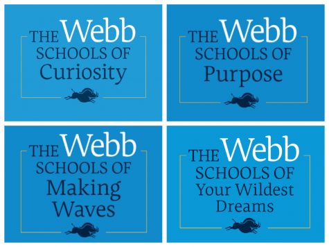
The second part of the logo features variable messaging. The variable messaging is, “The Webb Schools of …” which can be filled in with a variety of serious, playful and creative endings.
The variable messaging can be used to express the different parts of the Webb community. Graphic courtesy: Webb.org.
“I really like the idea of ‘The Webb Schools of,’ it is a way to capture the multi dimensions of a school,” Dr. Smith said. “It is also fun … There’s a bit of playfulness to it that captures us very well.”
The variable messaging allows different departments and parts of the community to mold the sayings into whatever they like.
“For Webb we felt that just a single tag line would not work because we are a very complex place, we have two schools and a museum,” said Joe Woodward, Director of Strategic communications. “We needed a system that allowed messaging that was serious so you could talk about honor and moral courage, and we also needed messaging that is fun and engaging that speaks to them now, working with the creative agency that can grow and add to it.”
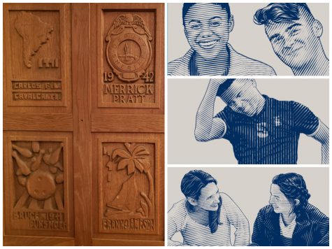
Furthermore, the new website and printed materials include images inspired by the wood prints made by Vivian Webb in Jackson Library. These new images help tie the brand back to Webb’s traditions and history.
On the left, examples of the wood panels that have inspired some of Webb’s new graphics. On the right, an example of these new images. Graphic courtesy: Mark Dzula and Webb.org.
One of the more subtle changes in the brand is the use of buzz words and shorter sentences as well as an approachable tone throughout the website. In this digital and busy world, brands must catch the attention of the viewer much quicker than before. “The Webb Schools of” provide viewers a chance to get a brief snapshot of Webb, as well as learn a little bit more of our personality.
“We are finding of course parents are looking at the website, but students coming to Webb are already really independent with their search process and we want the tone to be conversational to them,” said Sarah Garcia, Associate Director of Admission. “I think it’s a tone and style of writing that is appealing to students that are kind of coming into the community, so that they can we get a sense of who Webb is. We need our website to not only relay information, but it is important to convey the identity and that sense of community and that fun and that kindness that you experience when you’re actually on campus.”
Another part of the new brand is a focus on including more student voices and student experiences. Student stories and day in the life at Webb videos can be found on Webb.org and throughout the Webb social media accounts. Furthermore, students’ quotes and perspectives are scattered though out the website and are include in the printed publications.
The brand extends into our own internal contact with one another. If you have not noticed already, faculty, administrators, and staff have email signatures that now match each other. The consistently in fonts, colors, and structure of the email signatures is one of many examples of how the brand pushes our community to present a consistent and united image.
In addition, Webbies can expect to see the Webb School of California and Vivian Webb School crests only used internally.
“If you think about marketing it, Webb’s complicated to market,” Dr. Smith said. “There was a sense that our community feels like one community, so marketing ourselves as one community made a lot of sense. The way we use the crests has always been more internally anyway.”
From how Webb uses and takes photos, to the use of the new logo, all parts of the brand have consistent guidelines now. All parts of the rebrand serve the goal of representing the dynamic facets of the Webb community.
The new brand can be seen throughout all aspects of Webb’s marketing. From Webb socks to social media to printed marital the new look is easily identified by its distinct colors and wording. Graphic courtesy: Laura Haushalter.
Part 3 – The Impact
After talking about all these new changes to Webb’s brand, our schools’ brand, how do incoming and current members of our community feel about it? Do they like it? And does it represent them?
We talked to Wyatt Andrews (‘21), a current senior and talented digital artist, Emily Wang (‘22), current junior and honors art students, Syndey Wuu (‘20), VWS alumna and previous Editor-In-Chief here at the WCC, and Elizabeth Hastings, a prospective Webb student who has applied as an incoming freshman in 2021.
With the entirely redesigned website, many aspects stood out to viewers.
“The first thing I noticed was the new color,” Emily said. “Instead of the dark blue, the website is now filled with a very vibrant and bright blue.”
“
I think the logo is well designed and represents our school’s legacy of unbounded thinking and discovery, given how that peccary skull was found by accident all those years ago.
— Wyatt Andrews (‘21)
“The website looks cool, and I like the graphics. It’s neat and the peccary is cute,” Elizabeth said.
In addition, new changes did not go unnoticed either.
“I miss [the adobe brick color]. The blue, orange and white are so iconic, as the former two colors directly contrast each other on the wheel,” Wyatt said. “The uniform blue makes the website feel cold and corporate… Maintaining the old color palette with a newer sleeker design would be great.”
“I do miss it actually,” Emily said. “The old orange color feels ‘Webb’ to me…”
“I immediately noticed what appeared to me like a wild boar,” Sydney said. “I’ve been informed it’s a peccary, however, many non-Webb individuals do not know what a peccary is… To be honest, I preferred Webb’s original logo and wonder what has happened to the Gaul.”
Our interviewees appreciated the highlights of student voice.
“I remember there were a lot of photos of people,” Elizabeth said.
As a prospective student, Elizabeth does not know Webb as well as the current students and alumni, but she appreciated hearing students speak. Elizabeth said it made Webb more appealing to her.
“I think the visual of my peers being interviewed helps make the school seem more involved with its student body,” Wyatt said.
Another big change was the layout of the website: the switch from dropdown menus to a continuous scroll.
“It was fairly easy to navigate,” Elizabeth said. “I was looking for information and I found it pretty easily and quickly.”
“I would say [the website is user-friendly] for people on the outside who would like to learn more about the school, but for a student or faculty member, finding the log-in buttons is a bit inconvenient,” Wyatt said.
However, as a whole, Webb’s new brand landed well and positively with the viewers.
“I feel like the new logo is a way for Webb to directly and clearly state its values,” Emily said.
“I think the branding accurately represents Webb as a whole,” Wyatt said. “The inclusion of student interviews was a great idea and I love the new logo.”
As Joe Woodward, Director of Strategic Communications, said, branding is not just a website and a logo.
“Branding is much more than the color taglines and logos and whether people like them,” said Mr. Woodward. “It is about whether your messaging works, if people are reading to the end, and if they are acting on what they read.”
Enthusiastic, positive, determined, and athletic, Laura Haushalter (‘21) uses her passionate attitude to take on many leadership roles: captain of the...