Part 2 – The Outcomes
January 26, 2021
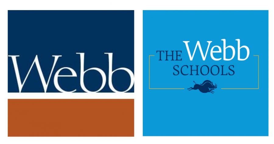
The new Webb Schools logo (right) is a sharp contrast to the old logo (left). Graphic courtesy: Laura Haushalter.
New colors, new messaging, new logos, and a new tone are some of the many changes that occurred as a result of Webb’s new brand. With our 100-year identity and our current times, these changes in the brand help reflect the Webb we know today.
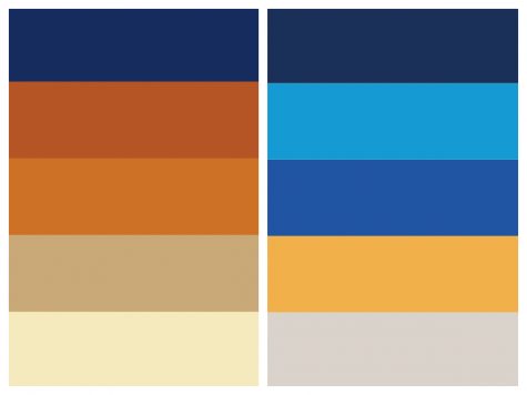
Anyone who visits Webb.org or sees the new Webb brand will quickly notice the very distinct and bright colors. The new color palate focuses on Webb’s history and geographical location, which helps embody our unbounded southern California personality.
The new primary palette includes two colors: Webb Blue and Unbounded Blue. Unbounded Blue is the background of the new logo. The words and peccary of the logo are in Webb blue. The secondary palette includes three new colors that draw from inspiration of our old colors and traditions: Vivian Blue, California Gold, and Alf Gray. The secondary palette is woven throughout other parts of the brand.
“I think the colors embody our mission,” Dr. Everett said. “Even though we moved away from the adobe the new colors are very bold and are very creative. [The colors] really do stand out, they are good for our west coast boarding school identity. I think this [new] look is very classic still and very clean … the brand does this interesting mix of being playful, fun and bold, but still traditional.”
In addition to the colors, the logo and imaging got revamped. Any successful brand must have a logo that is adaptable to different forms. You must be able to put it on social media, on the website itself, email signatures, and on printed marital. The new logo can easily be identified by the peccary pig, a node to the Raymond M. Alf Museum of Paleontology and way of research-led and unbounded inquiry learning at Webb.
In 1936, Raymond Alf and his student Bill Webb (‘39) found a mammal skull on a dig in the Mojave Desert. After the unknown mammal skull was identified as a new 15-million-year-old peccary pig, Raymond Alf was inspired to “elucidate the history of life on Earth through the study of fossils, which he called ‘the documents of life.” Since that find, hundreds of Webb students have embarked on “peccary trips” and have gotten to experience their own form of discovery.

“To me the peccary has always been a kind of metaphor for the kind of learning that we do here at Webb,” Dr. Smith said.
One of the main areas of focus was to make the imaging more inclusive of two of the major changes to the institution of Webb in the last 100 years: namely, the founding of Vivian Webb School and the Raymond M. Alf Museum of Paleontology. The peccary includes the museum in the logo but with less words.
“We wanted to … represent inclusiveness of all of these identities (WSC, VWS, and the Museum), we wanted to strengthen our image in terms of The Webb Schools,” Mr. Nichols said.
To alumni and current students, the peccary is a recognizable symbol but to most perspective families the peccary is something new. The peccary encourages perspective community members to ask: What is a Peccary? And what is Webb?
The second part of the logo features variable messaging. The variable messaging is, “The Webb Schools of …” which can be filled in with a variety of serious, playful and creative endings.
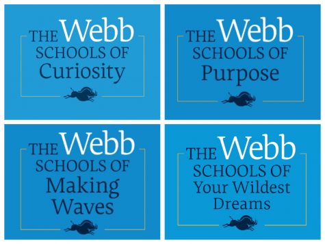
“I really like the idea of ‘The Webb Schools of,’ it is a way to capture the multi dimensions of a school,” Dr. Smith said. “It is also fun … There’s a bit of playfulness to it that captures us very well.”
The variable messaging allows different departments and parts of the community to mold the sayings into whatever they like.
“For Webb we felt that just a single tag line would not work because we are a very complex place, we have two schools and a museum,” said Joe Woodward, Director of Strategic communications. “We needed a system that allowed messaging that was serious so you could talk about honor and moral courage, and we also needed messaging that is fun and engaging that speaks to them now, working with the creative agency that can grow and add to it.”
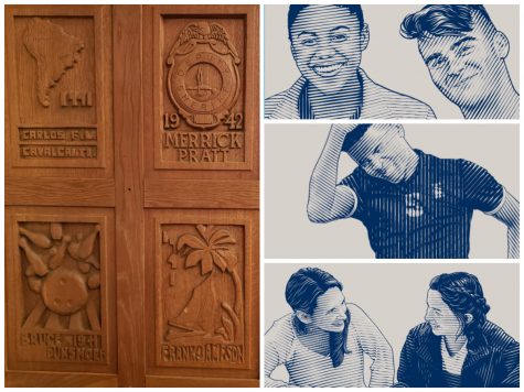
Furthermore, the new website and printed materials include images inspired by the wood prints made by Vivian Webb in Jackson Library. These new images help tie the brand back to Webb’s traditions and history.
One of the more subtle changes in the brand is the use of buzz words and shorter sentences as well as an approachable tone throughout the website. In this digital and busy world, brands must catch the attention of the viewer much quicker than before. “The Webb Schools of” provide viewers a chance to get a brief snapshot of Webb, as well as learn a little bit more of our personality.
“We are finding of course parents are looking at the website, but students coming to Webb are already really independent with their search process and we want the tone to be conversational to them,” said Sarah Garcia, Associate Director of Admission. “I think it’s a tone and style of writing that is appealing to students that are kind of coming into the community, so that they can we get a sense of who Webb is. We need our website to not only relay information, but it is important to convey the identity and that sense of community and that fun and that kindness that you experience when you’re actually on campus.”
Another part of the new brand is a focus on including more student voices and student experiences. Student stories and day in the life at Webb videos can be found on Webb.org and throughout the Webb social media accounts. Furthermore, students’ quotes and perspectives are scattered though out the website and are include in the printed publications.
The brand extends into our own internal contact with one another. If you have not noticed already, faculty, administrators, and staff have email signatures that now match each other. The consistently in fonts, colors, and structure of the email signatures is one of many examples of how the brand pushes our community to present a consistent and united image.
In addition, Webbies can expect to see the Webb School of California and Vivian Webb School crests only used internally.
“If you think about marketing it, Webb’s complicated to market,” Dr. Smith said. “There was a sense that our community feels like one community, so marketing ourselves as one community made a lot of sense. The way we use the crests has always been more internally anyway.”
From how Webb uses and takes photos, to the use of the new logo, all parts of the brand have consistent guidelines now. All parts of the rebrand serve the goal of representing the dynamic facets of the Webb community.