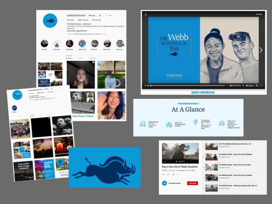
The new brand can be seen throughout all aspects of Webb’s marketing. From Webb socks to social media to printed marital the new look is easily identified by its distinct colors and wording. Graphic courtesy: Laura Haushalter.
Part 3 – The Impact
January 26, 2021
After talking about all these new changes to Webb’s brand, our schools’ brand, how do incoming and current members of our community feel about it? Do they like it? And does it represent them?
We talked to Wyatt Andrews (‘21), a current senior and talented digital artist, Emily Wang (‘22), current junior and honors art students, Syndey Wuu (‘20), VWS alumna and previous Editor-In-Chief here at the WCC, and Elizabeth Hastings, a prospective Webb student who has applied as an incoming freshman in 2021.
With the entirely redesigned website, many aspects stood out to viewers.
“The first thing I noticed was the new color,” Emily said. “Instead of the dark blue, the website is now filled with a very vibrant and bright blue.”
“The website looks cool, and I like the graphics. It’s neat and the peccary is cute,” Elizabeth said.
In addition, new changes did not go unnoticed either.
“I miss [the adobe brick color]. The blue, orange and white are so iconic, as the former two colors directly contrast each other on the wheel,” Wyatt said. “The uniform blue makes the website feel cold and corporate… Maintaining the old color palette with a newer sleeker design would be great.”
“I do miss it actually,” Emily said. “The old orange color feels ‘Webb’ to me…”
“I immediately noticed what appeared to me like a wild boar,” Sydney said. “I’ve been informed it’s a peccary, however, many non-Webb individuals do not know what a peccary is… To be honest, I preferred Webb’s original logo and wonder what has happened to the Gaul.”
Our interviewees appreciated the highlights of student voice.
“I remember there were a lot of photos of people,” Elizabeth said.
As a prospective student, Elizabeth does not know Webb as well as the current students and alumni, but she appreciated hearing students speak. Elizabeth said it made Webb more appealing to her.
“I think the visual of my peers being interviewed helps make the school seem more involved with its student body,” Wyatt said.
Another big change was the layout of the website: the switch from dropdown menus to a continuous scroll.
“It was fairly easy to navigate,” Elizabeth said. “I was looking for information and I found it pretty easily and quickly.”
“I would say [the website is user-friendly] for people on the outside who would like to learn more about the school, but for a student or faculty member, finding the log-in buttons is a bit inconvenient,” Wyatt said.
However, as a whole, Webb’s new brand landed well and positively with the viewers.
“I feel like the new logo is a way for Webb to directly and clearly state its values,” Emily said.
“I think the branding accurately represents Webb as a whole,” Wyatt said. “The inclusion of student interviews was a great idea and I love the new logo.”
As Joe Woodward, Director of Strategic Communications, said, branding is not just a website and a logo.
“Branding is much more than the color taglines and logos and whether people like them,” said Mr. Woodward. “It is about whether your messaging works, if people are reading to the end, and if they are acting on what they read.”