Dorm students. Day students. Teachers. Faculty. Vivian Webb. Webb. There are so many categories that divide us as a school. However, there is one thing that unifies us: architecture.
Webb life is centered around architecture. Students go from classroom to classroom and eventually back to their dorm or home when the day ends. Faculty members work hard in the same building for hours on end. We are constantly surrounded by these admirable works of architecture, but how many people actually notice them?
As it turns out, not a lot of people do, and it is not entirely their fault. People are often too focused on what is for lunch, who they are going to talk to, or where they are going to sit to notice the architecture around Webb. If they were to appreciate architecture, though, these people would be pleasantly surprised.
“I like architecture, especially the architecture at the library, but unfortunately not a lot of people take the time to appreciate it,” said Melissa Mani, assistant librarian. “Everyone is in a rush.”
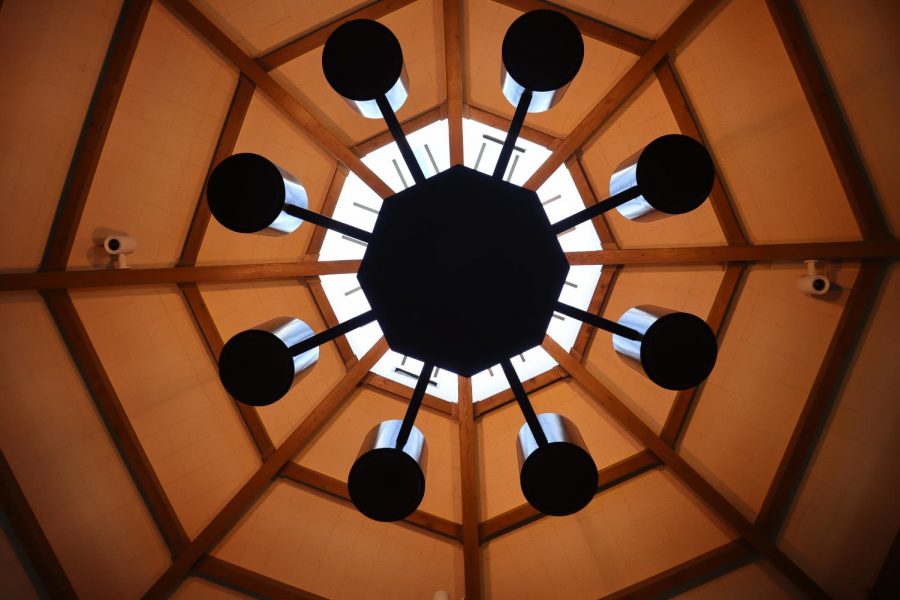
The Fawcett Library is a local hotspot for students. Throughout the day, the library is jampacked with people, studying, socializing, or even sleeping. All of these eyes are in the library, yet almost none of them look up.
The library ceiling is a remarkable sight. The marvelous octagon pattern is a design choice so simple, yet so fascinating to behold. The way light comes in through the windows makes the library have a “cozy feeling” that so many people enjoy. These little details that students often do not notice all unconsciously add up to an amazing atmosphere.
“No matter how advanced technology gets, Webb needs to have a blend of modern and classic architecture to honor the school’s traditions and history.” Simon Kang (‘22) said. “And, as of right now, Webb has a good blend.”
The newly renovated Hooper Community Center is a fascinating example of classic architecture turned modern. Before the renovation, Hooper was described as an “empty lot” that only a few students went to, but now, after the redesign, Hooper is a lot more accessible.
Hooper’s layout is purposeful, and every design decision has a unique purpose. Starting from the top, Hooper has a magnificent glass dome. This design was chosen so Hooper could be illuminated by the moon and stars at night, which characterizes it as a safe space to be in. The inside of the building, however, is even more interesting.
Hooper is separated into multiple small sections. There is a huge open center space with chairs scattered about. Even though this space promotes community, some may desire a more private area. There are two symmetrical table sections that provide some secluded peace in the sometimes chaotic recreation center. The café section provides visitors with moderate sitting space to work. Even the upstairs classrooms were designed for people to socialize and work.
With such simple and smart design choices, Hooper accommodates every type of student —people who want to work, people who want to socialize, and people to want to lounge. These simple design choices embrace community and individuality, which strengthens Webb’s sense of home.
“I think that architecture at Webb is not talked about enough.” Izzy Kim (‘24) said. “It is important for the feel of Webb. Without architecture, I think that the experience of Webb would be drastically changed.”
Architecture is less about actual buildings and more about the history and traditions behind them. For example, the chapel is one of the only original buildings constructed at the founding of Webb. When people see the Vivian Webb Chapel, they should not just see a building. They should see a snapshot of our campus from 100 years ago. They should reflect on the meaning of history. They should envision Thompson Webb, Vivian Howell, and the class of 1922 learning in a Webb of a different time.
The architecture of the chapel is crucial for many traditions. The atmosphere of the chapel supplements everything, from the Chapel Talks to Candlelight Ceremony. The narrow shape of the chapel brings the front of the room to the center of attention, perfectly enhancing the experience of Chapel Talks. Candlelight Ceremony would not be the same without the structure of the chapel; the seniors stand in the illuminated front of the building while the rest of the school sits in darkness, partially lit up by the candles.
For boarders, Community Dinner is enriched by the architecture of the Price Dining Hall. The high ceiling, the countless rows of lamps, and the numerous flags on the wall contribute to a sense of community that helps boarders adjust to their surroundings and be more comfortable in their second home: Webb.
Architecture is incredibly crucial for the school. It gives dorm students a roof to sleep under, the teachers a classroom to teach in, and faculty a place to work. Most importantly, however, architecture teaches us to open our eyes and realize that beauty is everywhere.


